
Brand Compare
The Brand Compare page answers one question: in AI responses, who is winning — you or your competitors, and where exactly is the gap? The Dashboard and Mentions pages tell you how you are doing; Brand Compare puts multiple brands on the same charts to show how you’re doing relative to everyone else.
Why you need it
Section titled “Why you need it”A number in isolation means nothing. Say your Mention Rate is 35% — is that good or bad? If your competitors hover around 10%, you’re dominating. If the category leader sits at 80%, you’re clearly behind. Same number, opposite conclusions — the only difference is the frame of reference.
Brand Compare is that frame of reference: it draws you and your competitors on the same timeline, the same platform matrix, and the same quadrant chart, so you can see at a glance who’s rising, who’s slipping, and on which platform the gap lives. Whenever your Competitive Rank moves and you need to find out why, start here.
Selecting brands and the date range
Section titled “Selecting brands and the date range”Start by selecting the brands to compare. The candidate list is every monitored brand in your project (you plus the competitors you’ve configured), and you can select up to 5 brands at a time. A good default is yourself plus your 3–4 most direct rivals — more lines than that and the charts get hard to read.
Use the date range switcher at the top of the page to choose Last 7 Days, Last 14 Days, or Last 30 Days. Every chart recalculates based on your selected brands, platforms, and time range.
Mention Rate Trend
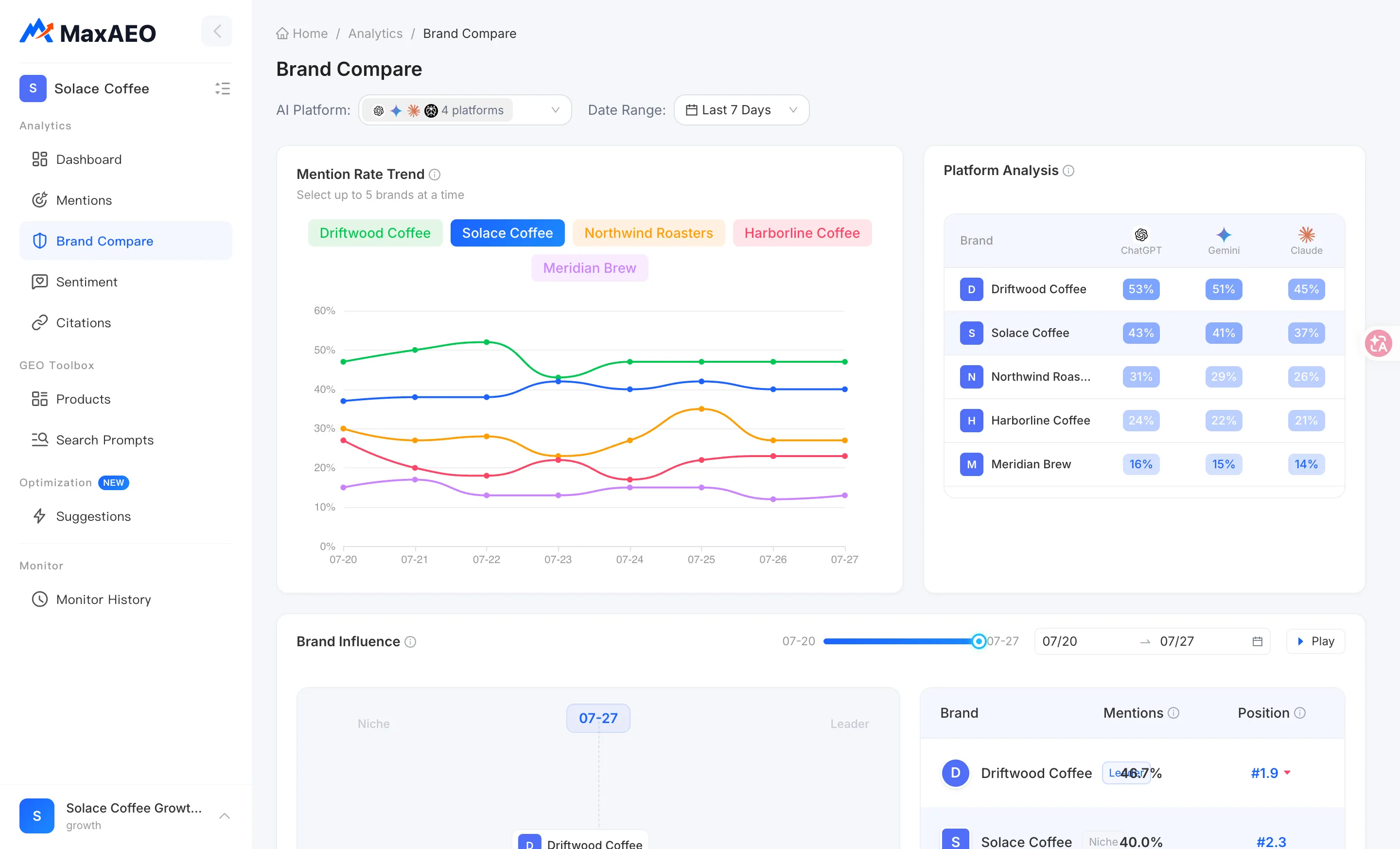
Section titled “Mention Rate Trend”What it is: a multi-line chart showing each selected brand’s Mention Rate over time — the share of AI responses across all your monitored prompts that mention each brand.
How to read it: don’t fixate on any single day. Look for spread and crossovers:
- Is the gap between two lines widening or narrowing? A narrowing gap means the distance is closing — whether you’re the one chasing or being chased.
- Are there crossover points? A competitor’s line crossing above yours is usually the exact moment your Competitive Rank flipped — worth going back to that date to investigate what happened.
- Does a line jump suddenly? Suspect a one-off first. AI responses are inherently non-deterministic, so single-day swings are normal; only a move sustained over several days is a real trend.
Platform Analysis
Section titled “Platform Analysis”What it is: a heatmap matrix of brand × AI platform. Each row is a brand, each column an AI platform (ChatGPT, Gemini, Claude, Perplexity, and so on), and darker cells mean a higher mention rate for that brand on that platform.
How to read it: the heatmap’s real value is breaking a blended, all-platform mention rate down to per-platform granularity — two brands with similar overall numbers can have completely different platform footprints. Hunt for two kinds of cells:
- Columns where competitors are dark and you are light: these are your weak battlegrounds — platforms where they’re strong and you’re not. For example, if your ChatGPT cell is deep-colored but your Perplexity cell is nearly blank while a competitor owns the darkest cell in that column, Perplexity users are effectively only ever hearing that competitor’s name.
- Columns that are light for everyone: no brand gets mentioned much there, meaning AI on that platform hasn’t really absorbed your category yet. That’s unclaimed territory — the first brand to show up wins the most.
What to do about it: once you’ve found a lagging platform, head to Optimization for targeted content actions. Different AI platforms favor different citation sources, so check the Channels guide when picking where to publish.
Brand Influence
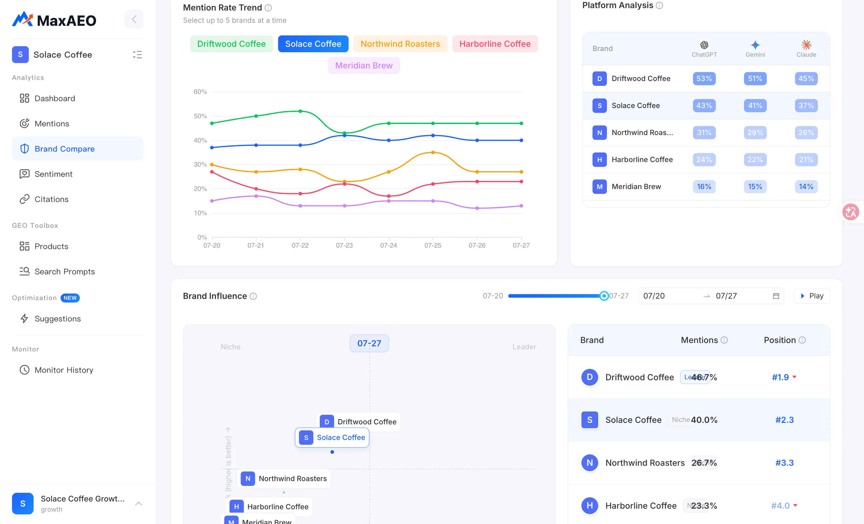
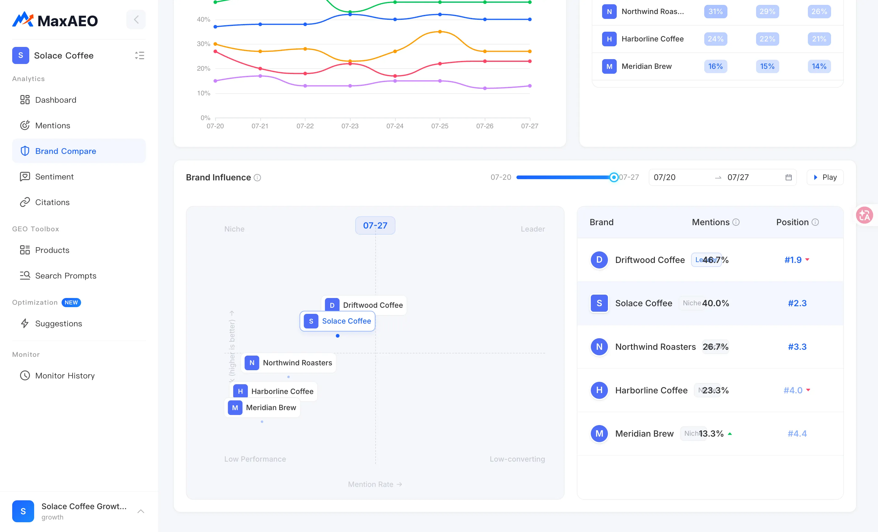
Section titled “Brand Influence”What it is: a bubble chart where each bubble is a brand. The X-axis is Mention Rate (how often AI mentions the brand) and the Y-axis is Rank (the brand’s average position in AI responses — higher is better). A bubble’s location reflects both the brand’s coverage in AI responses and how strongly AI recommends it.
Together the two axes split the chart into four quadrants:
| Quadrant | Position | What it means | One-line action |
|---|---|---|---|
| Leader | High mention rate + high rank | AI mentions you often and puts you near the top | Defend the lead: keep content and sources fresh so challengers can’t chip away at you |
| Niche | Low mention rate + high rank | AI rarely mentions you, but ranks you high when it does | Grow visibility: publish content covering more of your monitored prompts to turn “respected” into “frequently mentioned” |
| Low Performance | Low mention rate + low rank | Rarely mentioned, and buried when you are | Build from zero: start with Optimization actions targeting your zero-mention prompts |
| Low-converting | High mention rate + low rank | AI mentions you constantly but keeps listing you below competitors | Climb the list: sharpen differentiated selling points and authoritative sources so AI moves you up |
A concrete example to separate the two commonly confused quadrants: Brand A has a 20% mention rate but averages the #1 spot when mentioned — that’s Niche; its problem is exposure, not credibility. Brand B has a 70% mention rate but averages the #5 spot — that’s Low-converting; AI always thinks of it but never leads with it. Their weaknesses are opposite, and so are the fixes.
Timeline animation: hit Play and the bubbles move frame by frame through time, tracing each brand’s path across the quadrants; hit Pause to freeze any moment. This is the most intuitive way to watch the competitive landscape evolve — if you see a competitor migrating from Niche toward Leader, treat it as an emerging threat.
A suggested analysis path
Section titled “A suggested analysis path”- Select yourself plus 3–4 core competitors, set the range to Last 30 Days, and start with the Brand Influence chart to establish which quadrant each brand sits in — that’s your snapshot of the current landscape.
- Play the timeline animation and spot any brand closing in on you or rising fast.
- Switch to the Mention Rate Trend to confirm whether that rise is a sustained trend or single-day noise.
- Use the Platform Analysis heatmap to pinpoint which platform they’re strong on and which platform you’re weak on.
- Take your conclusion — which platform, which kinds of questions — to Optimization for concrete content actions, or to Mentions to audit prompt by prompt where you’re not being mentioned.