I kept finding “best AI visibility tool” lists that compared feature pages but never published the questions they used to test the products. That makes the ranking difficult to challenge and impossible to reproduce. Change the prompts, assistants, geography, or date and the winner can change.
So I used one fixed prompt set across eight AI surfaces and evaluated ten tools by the job they can actually complete. I work on MaxAEO, one of the products in the test, so I did not rank it first or turn the result into a universal winner. I grouped every product by workflow stage and kept the method visible.
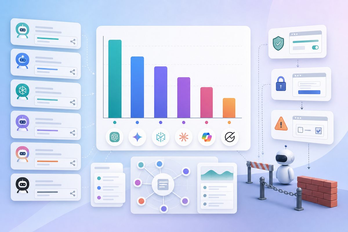
The run used 40 buying-intent prompts and produced 2,173 answers. The assistants covered ChatGPT, Gemini, Claude, Perplexity, Copilot, Grok, Google AI Mode, and Google AI Overview. The useful result was not a league table. It was a clearer picture of what AI visibility means, where measurement breaks, and which tool fits which operating model.
AI visibility is not a search ranking
A search rank is a position on a results page for a query. An AI answer is assembled from a changing set of model behavior, retrieval sources, and generated language. A brand can therefore appear in three materially different ways.
Mention means the answer names the brand. It is the broadest measure and the easiest to inflate. A brand listed in a long set of alternatives receives a mention even when the answer gives it no meaningful endorsement.
Recommendation means the answer connects the brand to the user’s need. “Consider Product X for multi-brand agency reporting” is more useful than a bare appearance because it contains a reason and a use case.
Citation means the assistant links to or attributes a source that supports the answer. Citations help explain why the answer took its shape. They can point to the brand’s own site, a review, a comparison page, a community thread, or another third-party source.
These measures should not be collapsed too early. A rising mention rate with flat recommendation language may be awareness without preference. A citation increase from unrelated pages may not improve how the brand is described. I wanted the test to preserve those distinctions.
The fixed-prompt method
The method was deliberately plain: same questions, same time window, same scoring rules. Sophisticated dashboards cannot rescue a comparison built on different inputs.
I divided 40 prompts into four intent groups:
- Category discovery: questions such as “What are the best GEO tools for monitoring how a brand appears in AI-generated answers?”
- Problem and solution: questions from teams whose competitors dominate AI recommendations.
- Comparison: questions asking which platform fits agencies, startups, or multi-brand teams.
- Workflow: questions asking for citation diagnosis, content priorities, or actions based on competitor gaps.
I avoided brand names in the test questions. A branded prompt measures recognition after the buyer already knows the product. The harder and more useful question is whether an assistant introduces the product unprompted.
Each prompt was run across eight AI surfaces within the same collection window. The resulting 2,173 answers were scored for brand mention, recommendation context, position, sentiment, and cited sources. A recommendation required a fit statement, not merely inclusion in a list. A citation required an observable source reference.
There is still judgment involved. An answer such as “Product X may work for larger teams” is weaker than “Choose Product X if you need enterprise governance,” but both contain recommendation language. The practical answer is to document the rule, sample ambiguous cases, and apply the same rule across products.
I also reviewed every platform separately before looking at a combined number. Averages are useful for reporting, but they can hide the very difference a team needs to act on.
Three findings changed how I read GEO dashboards
1. Citation density varies too much for a blind average
The number of sources attached to an answer differed by more than tenfold across the surfaces in the action dataset, from roughly 2.8 to 43.2 sources per answer. That means a brand can have a citation problem on one platform and a recommendation-language problem on another.
When one assistant tends to cite dozens of pages and another cites only a few, raw citation totals are not directly comparable. I now start with platform-level rates and only then build a blended view. Otherwise, a citation-heavy surface dominates the dashboard.
2. The source layer is often outside the brand’s site
The monitored answers repeatedly drew on third-party comparisons, individual-author posts, tool directories, and editorial pages. External research cited in the action brief reports similarly low overlap among engines and a large third-party share of AI citations.
That changes the optimization question. “What should we publish on our blog?” is only one part of the work. The larger question is: which sources shape the answers for this prompt cluster, what claims do they support, and where is the brand absent or inaccurately framed?
This is why source-level attribution matters. A tool that only tells you the brand’s mention rate identifies the symptom. It does not tell you which evidence environment produced it.
3. A snapshot is not a trend
AI answers drift as models, retrieval indexes, citations, and competing pages change. The action brief cites external research estimating substantial monthly citation movement. Even without adopting a universal drift percentage, the operating implication is clear: a single week can produce a strong opinion with weak evidence.
I would not choose a platform based on one polished report. I would check whether it preserves prompt history, shows platform-level changes, and lets the team connect a content or distribution action to later answer changes.
Ten tools grouped by the job they complete
This is not a ranking. It is a map from operating need to product category. Prices below are included only where the run’s sourced brief provided a starting point; current packages and usage limits should be checked at the moment of evaluation.
Monitoring-focused tools
Otterly.AI
Best fit: A small team that wants a low-friction entry into AI search monitoring.
Otterly.AI tracks prompts, mentions, links, and visibility across major AI answer environments. Its $29 monthly starting point in the run’s source set makes it approachable for an initial program. The boundary is workflow depth: teams that need source diagnosis, content actions, and multi-cycle operational tracking should test those steps explicitly rather than assuming every monitoring plan includes them.
Peec AI
Best fit: Marketing teams that want a dedicated AI visibility dashboard with straightforward competitor comparison.
Peec AI centers the product around tracking how brands appear in AI answers and comparing visibility. The sourced starting point in the run was $95 per month. Its fit is strongest when the team already knows how it will turn gaps into work. Buyers should examine export, prompt-management, and action-tracking requirements during the trial.
Semrush AI Visibility Toolkit
Best fit: Existing Semrush users who want AI visibility alongside a broader search workflow.
Semrush brings AI visibility into a familiar SEO and competitive-research environment. That can reduce tool sprawl for an established search team. The tradeoff is category breadth: a broad suite and a specialist GEO operating system optimize for different buyers, so test the exact assistants, prompt controls, source views, and action handoff your team needs.
Monitoring plus source attribution
Ahrefs Brand Radar
Best fit: Teams that value a very large search and AI-answer corpus alongside established web-link research.
Brand Radar connects AI visibility with Ahrefs’ broader data environment. The Medium sample most frequently cited in this run emphasizes its large corpus and platform coverage. It is a natural evaluation candidate for teams already working in Ahrefs. The key question is whether the workflow ends at analysis or supports the team’s required planning and follow-through.
Scrunch AI
Best fit: Brands focused on how AI systems understand, represent, and retrieve their product information.
Scrunch AI approaches the problem through brand presence and the information layer that feeds AI experiences. That is useful when incorrect descriptions and weak source representation matter as much as mention rate. Teams seeking a simple low-cost tracker may find the product’s strategic scope broader than necessary.
AthenaHQ
Best fit: Growth and SEO teams that want visibility analysis connected to practical content opportunities.
AthenaHQ is commonly evaluated for GEO monitoring, competitor intelligence, and opportunities to improve performance in AI answers. It sits between a pure tracker and a broader optimization workflow. During evaluation, I would ask to trace one missing recommendation from prompt to source evidence to a concrete content decision.
Writesonic GEO
Best fit: Content teams that want AI visibility insights near an existing content production suite.
Writesonic combines GEO monitoring with a larger content platform. The proximity can be convenient when writers need to respond quickly to visibility gaps. The boundary is measurement independence: teams should make sure recommendations are grounded in the observed answer and citation data, not merely converted into another generic writing brief.
Monitoring connected to action and review
Profound
Best fit: Enterprises that need extensive AI visibility infrastructure, governance, and strategic support.
Profound is frequently positioned for large organizations with complex brand and reporting requirements. The run’s source set placed its entry around $400 per month, although enterprise scope can vary considerably. It deserves evaluation when procurement, scale, custom analysis, and cross-team governance matter. A smaller team may not need that operating footprint.
MaxAEO
Best fit: Teams that want to move from daily multi-engine monitoring into citation diagnosis, prioritized content actions, and later review.
MaxAEO covers eight AI surfaces, competitor benchmarking, sentiment, citation tracing, and an optimization workflow. The reason it sits in this group is not that it wins every feature comparison. It is designed to keep monitoring and action in one loop: identify a prompt gap, inspect the sources shaping that gap, generate an optimization action, and review subsequent monitoring changes.
Its boundary is equally important. A company that only wants a broad legacy SEO suite may prefer Semrush or Ahrefs. A large enterprise seeking bespoke agents and procurement support should compare enterprise platforms such as Profound. MaxAEO fits teams that specifically want AI-answer monitoring tied to an operating queue.
HubSpot AEO Grader
Best fit: Teams that want a quick diagnostic within a HubSpot-centered marketing workflow.
HubSpot’s AEO tooling can introduce marketers to how a brand appears in AI search and connect the topic to an existing inbound stack. It is useful as a starting diagnostic. Teams building an ongoing GEO program should distinguish a grader from daily prompt monitoring, source attribution, competitor history, and a managed action backlog.
How I would choose among them
Start with the missing workflow step, not the longest feature list.
If you have no baseline, choose a monitoring product you can configure quickly and run the same prompt set for a month. If you already track mentions but cannot explain them, prioritize source-level citation views and platform-by-platform history. If analysis exists but actions stall, test how each product turns a gap into an owner, content task, placement decision, and follow-up measurement.
For every demo, bring one prompt where a competitor is recommended and your brand is absent. Ask the vendor to show the complete path from answer to source to action. A canned dashboard tour cannot answer that question.
A five-step protocol you can reuse
- Freeze 30–50 prompts. Split them by discovery, comparison, problem/solution, and workflow intent. Remove brand names unless branded recognition is the specific metric.
- Run the same set across the same assistants in one collection window. Record model or product variants where they are visible.
- Score mention, recommendation, position, sentiment, and citation separately. Write down how ambiguous language is handled.
- Review each assistant before calculating a combined score. Look for platform-specific source gaps and description differences.
- Repeat monthly without rewriting the baseline set. Add exploratory prompts in a separate group so the trend remains comparable.
The fixed prompt set matters more than the dashboard you choose. Without stable inputs, a more attractive chart only makes an unstable comparison look precise.
If you rerun this protocol, I would be interested in where your results disagree—especially which assistants share sources, which tools make source attribution usable, and which recommendation rules create the most disagreement between reviewers.