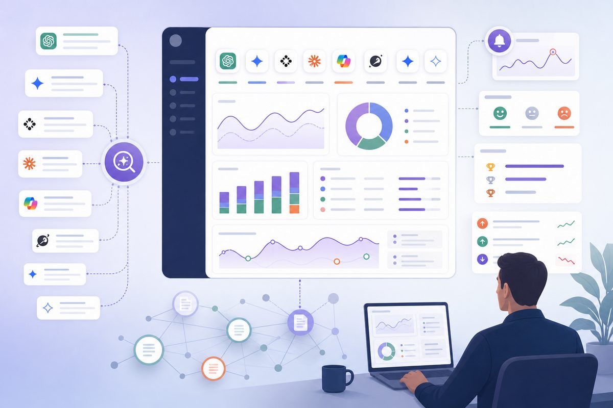
An AI visibility dashboard shows how often, where, and how AI answer engines mention your brand across the prompts buyers use before they make a shortlist. A useful dashboard does more than count mentions. It shows whether your brand is recommended, cited, described accurately, compared fairly, and gaining ground against competitors.
For marketing leaders, the operating question is simple: Are AI systems making us easier or harder to buy?
What is an AI visibility dashboard?
An AI visibility dashboard is a reporting view that tracks brand presence, recommendations, citations, sentiment, accuracy, competitor movement, and source risk across AI answer engines such as ChatGPT, Gemini, Perplexity, Claude, Copilot, Grok, Google AI Mode, and AI Overviews.
A traditional SEO dashboard starts with rankings, impressions, clicks, and conversions. An AI search monitoring dashboard starts with answer text:
- Was the brand mentioned?
- Was it recommended or only listed?
- Which competitor appeared first?
- Which sources were cited?
- Did the answer repeat a wrong claim?
- Did visibility change enough to require action?
The dashboard is therefore part brand monitoring, part answer engine optimization, part source-quality audit, and part executive scorecard.
What should an AI visibility dashboard show?
A weekly AI visibility dashboard should show five groups of metrics: visibility, preference, accuracy, source footprint, and escalation. This keeps the dashboard focused on decisions instead of creating a large report nobody uses.
Use the V-SAFE framework:
| V-SAFE area | What it monitors | Executive question |
|---|---|---|
| Visibility | Mentions, engine coverage, prompt coverage | Are we present where buyers ask? |
| Share | AI share of voice, first mention, shortlist ownership | Are we preferred over competitors? |
| Accuracy | Message accuracy, sentiment, positioning errors | Are AI answers describing us correctly? |
| Footprint | Citations, source mix, source freshness, citation support | Which sources shape the answer? |
| Escalation | Alerts, owners, severity, fixes shipped | What changed, and who is fixing it? |
This framework is useful because AI visibility problems rarely have one cause. A brand can be mentioned often but not recommended. It can be recommended but described inaccurately. It can be cited from a third-party page that is outdated or biased. The dashboard has to separate those conditions.
What current AI visibility dashboards often miss
Many AI visibility reports stop at a blended score: “Your brand appeared in 42% of tracked answers.” That number is easy to understand, but it is usually not enough to act on.
The missing layer is diagnosis. A marketing team needs to know:
- whether the score changed because of one engine, one prompt cluster, or one competitor;
- whether the brand was recommended or merely named;
- whether the cited source actually supports the claim;
- whether the answer used current product, pricing, integration, and security information;
- which team owns the fix.
A dashboard should not hide the raw answer. Every chart should allow a practitioner to inspect the prompt, engine, answer, citations, competitors, labels, and collection date behind the number.
The first screen: 10 metrics worth showing every week
The executive view should fit on one screen. Put the detail in diagnostic tabs, not on the front page.
| Dashboard zone | Weekly metric | Why it matters |
|---|---|---|
| Visibility | Mention rate | Shows whether AI systems include your brand at all |
| Visibility | Engine coverage | Shows whether visibility depends on one platform |
| Preference | Recommendation rate | Separates passive mentions from buying advice |
| Preference | AI share of voice | Shows whether competitors own the answer set |
| Preference | First-mentioned brand rate | Tracks prompt-level preference and ordering |
| Accuracy | Message accuracy rate | Finds outdated, wrong, or misleading descriptions |
| Accuracy | Sentiment split | Surfaces reputation risk in AI answers |
| Sources | Owned citation rate | Shows whether your own evidence pages support answers |
| Sources | Citation-support match | Checks whether cited URLs support the claim made |
| Escalation | Significant change count | Keeps the team focused on changes that need action |
For a deeper KPI glossary, use the related guide to AI search metrics and weekly KPIs.
How should visibility be calculated?
Visibility should be calculated from repeated answer observations, not one prompt run. The basic formula is:
Mention rate = answers where your brand appears / total answer observations
An observation is one answer from one engine for one prompt at one collection time. If you track 100 prompts across 6 engines and run each prompt 3 times, you have 1,800 answer observations for that collection cycle.
Segment visibility by:
- engine;
- prompt cluster;
- buyer stage;
- geography and language;
- product line;
- branded vs non-branded prompt;
- priority tier.
Use separate metrics instead of one blended score:
| Metric | Formula | What it answers |
|---|---|---|
| Mention rate | Brand-mentioned observations / total observations | Are we present? |
| Recommendation rate | Brand-recommended observations / total observations | Are we suggested as a choice? |
| Citation rate | Observations citing your owned or approved URLs / total observations | Are answers grounded in our evidence? |
| Engine coverage | Engines where brand appears / engines tracked | Is visibility broad or concentrated? |
| Priority visibility | Weighted visible observations / weighted total observations | Are we visible on revenue-relevant prompts? |
AI answers vary. A 2026 preprint, Quantifying Uncertainty in AI Visibility, argues that single-run visibility estimates can look more precise than they are because generative answers and citations shift across repeated samples. That is why the dashboard should show sample size, trend, and engine split near the headline score.
How many prompts should you track?
Most B2B SaaS and technology teams should start with 50 to 150 prompts. That is enough to cover major buyer questions without creating labeling overhead the team cannot maintain.
A balanced starter set:
| Prompt type | Share of set | Example |
|---|---|---|
| Branded | 15% | “What is [brand] used for?” |
| Category | 25% | “Best AI visibility dashboard for B2B SaaS” |
| Problem | 20% | “How do I track brand mentions in ChatGPT?” |
| Comparison | 15% | “[brand] vs [competitor]” |
| Alternative | 10% | “Alternatives to [competitor] for AI search monitoring” |
| Proof and risk | 10% | “Is [brand] accurate for enterprise reporting?” |
| Reputation | 5% | “Is [brand] a good company to work with?” |
Do not overbuild the first prompt set. The better approach is to version prompts, run them consistently, and expand after you know which clusters produce business-relevant movement.
How should AI share of voice be reported?
AI share of voice is your brand’s share of all tracked brand and competitor mentions within a defined prompt set. It should be calculated against a fixed competitor list, not against the entire internet.
Formula:
AI share of voice = your brand mentions / all tracked brand and competitor mentions
Use the same competitor set each week. If you add or remove competitors, mark the dashboard because the trend line is no longer comparable.
Example:
| Brand | Weekly AI mentions | AI share of voice |
|---|---|---|
| Your brand | 276 | 23.1% |
| Competitor A | 418 | 35.0% |
| Competitor B | 233 | 19.5% |
| Competitor C | 174 | 14.6% |
| Other tracked brands | 93 | 7.8% |
The executive takeaway is not “23.1%.” The useful takeaway is: Competitor A owns comparison and shortlist prompts, while your brand appears mainly in branded prompts. That tells content, PR, product marketing, and partnerships where to work.
How do you tell a mention from a recommendation?
A mention is not the same as a recommendation. This distinction is one of the most common dashboard mistakes.
| Label | Definition | Example |
|---|---|---|
| Mentioned | Brand appears anywhere in the answer | “Other tools include Brand X.” |
| Shortlisted | Brand appears in a list of relevant options | “Consider Brand X, Brand Y, and Brand Z.” |
| Recommended | Brand is suggested for a specific use case | “For enterprise teams, Brand X is the strongest fit.” |
| Preferred | Brand is ranked first or framed as best | “Brand X is the best option for this need.” |
| Excluded | Brand does not appear, but competitors do | “The answer recommends three competitors.” |
A dashboard should report recommendation rate separately from mention rate. If a brand is often mentioned but rarely recommended, the fix is usually not more awareness content. It is stronger proof, clearer differentiation, better comparison coverage, or more credible third-party validation.
How should sentiment and message accuracy be scored?
Sentiment shows tone. Message accuracy shows whether the answer is correct. Track both, but treat accuracy as the more actionable metric.
A positive answer that describes the wrong product, market, price, integration, or security posture can still hurt pipeline quality.
Use four labels:
| Label | Definition | Example action |
|---|---|---|
| Accurate positive | Correct and favorable | Preserve and reinforce the source path |
| Accurate neutral | Correct but thin | Add proof points and stronger differentiation |
| Inaccurate positive | Favorable but wrong | Correct owned pages and high-cited sources |
| Inaccurate negative | Wrong or harmful | Escalate to PR, support, legal, or product marketing |
Common B2B SaaS inaccuracies include:
- old product names;
- retired integrations;
- wrong pricing model;
- outdated customer segment;
- missing security or compliance credentials;
- incorrect funding or acquisition facts;
- competitor-biased comparisons;
- confusing the company with a similarly named brand.
The weekly dashboard should list the top recurring inaccurate claims, not only the sentiment percentage. The fix queue should start with repeated claims that appear across multiple engines or priority prompts.
Which citation and source metrics matter?
Citation metrics matter because AI systems often rely on sources outside your own site. A brand can publish accurate information and still be misrepresented if AI answers cite old reviews, outdated marketplace pages, forums, PDFs, partner pages, or competitor comparisons.
A 2026 preprint, How Large Language Models Source Brand Reputation Across Languages and Markets, analyzed 167,551 URL-grounded citations across 128 brands and found that 85.7% of citations pointed to third-party sites, while 14.3% pointed to brand-owned sites. Treat those numbers as study findings, not universal benchmarks, but the pattern is important: AI brand perception is often built from external evidence.
Track these source metrics:
| Source metric | What to measure | Why it matters |
|---|---|---|
| Owned citation rate | Citations to your website, docs, blog, case studies, and help center | Shows whether your evidence is being used |
| Third-party citation rate | Citations to media, review sites, communities, analyst pages, directories, and partners | Shows dependence on outside sources |
| Citation-support match | Whether the cited page supports the answer’s claim | Catches unsupported or misleading citations |
| Source freshness | Publication or update age of cited pages | Flags outdated sources shaping current answers |
| Source risk count | Weak, stale, incorrect, negative, or irrelevant sources | Prioritizes remediation |
| Source concentration | Share of citations from top domains | Shows whether one source can swing perception |
A 2026 preprint on Google AI Overviews measurement reported that, in its sample, 11.0% of atomic claims were unsupported by the cited pages. That makes citation-support matching a necessary dashboard field, not an optional QA task.
When a citation problem appears, diagnose the source path before rewriting content. The deeper workflow belongs in AI citation tracking for finding and fixing sources.
How should competitor movement be displayed?
Competitor movement should be shown by prompt cluster, engine, and answer position. One blended competitor score hides the prompts that matter most.
For weekly reporting, use three views:
| View | What to show | Best use |
|---|---|---|
| Shortlist ownership | Which brands appear in recommendation lists | Category and “best tool” prompts |
| First mention | Which brand is named first | Preference and answer-order tracking |
| Displacement | Which competitor appears when you do not | Content gap and PR prioritization |
A 2026 preprint, Who Owns the AI Recommendation?, studied 3,750 responses across 50 brands, five industries, and three models. It found 41.6% cross-model agreement on the top-recommended brand in its sample. The practical lesson is that a brand can lead in one engine and disappear in another.
The weekly question should not be “Are we winning AI search?” It should be:
Which engines, buyer prompts, and competitor sets are we winning, losing, or failing to enter?
What should the raw data model include?
A reliable AI visibility dashboard needs a consistent answer-level data model. Without it, the team cannot audit the numbers or explain movement.
Minimum fields:
| Field | Example |
|---|---|
| Collection date | 2026-07-08 |
| Engine | ChatGPT, Gemini, Perplexity, Claude, Copilot, Grok, Google AI Mode |
| Locale | US-English, UK-English, German-Germany |
| Prompt ID | COMPARE-SECURITY-004 |
| Prompt text | “Best AI visibility dashboard for enterprise SaaS security teams” |
| Prompt cluster | Category, comparison, problem, reputation |
| Buyer stage | Awareness, evaluation, purchase |
| Brand mentioned | Yes / No |
| Brand position | First, second, third, body-only |
| Recommendation status | Mentioned, shortlisted, recommended, preferred, excluded |
| Competitors mentioned | Competitor A, Competitor B |
| Citations | URLs and domains |
| Source type | Owned, media, review, community, partner, docs, unknown |
| Sentiment | Positive, neutral, mixed, negative |
| Accuracy label | Accurate, partially accurate, inaccurate, unverifiable |
| Claim needing review | “Brand is SMB-only” |
| Raw answer | Full answer text |
| Screenshot or export | Evidence for review |
| Reviewer | Person or workflow label |
| Change note | Model update, prompt edit, source change, site update |
The raw answer field is not optional. Leaders will eventually ask, “What did the AI actually say?” The dashboard should answer without a manual search.
How do you build an AI visibility dashboard from raw answers?
Build the dashboard by defining buyer prompts, collecting repeated answers, extracting entities and citations, labeling recommendation and accuracy, normalizing competitors, and summarizing movement by week.
A practical sequence:
- Define 50 to 150 prompts across branded, category, comparison, alternative, problem, proof, and reputation queries.
- Group prompts by buyer stage, product line, market, language, and priority.
- Run prompts across target AI answer engines on a fixed schedule.
- Repeat prompt runs so one answer does not control the trend.
- Extract brand mentions, competitors, answer position, recommendations, citations, and claims.
- Label sentiment, accuracy, and recommendation status.
- Map cited URLs to owned, media, review, community, partner, documentation, or unknown sources.
- Normalize brand aliases, product names, and competitor names.
- Build weekly trend lines for each metric.
- Create alert rules with thresholds, owners, and raw answer examples.
- Track shipped fixes and compare the next reporting cycle.
Teams evaluating this workflow should audit the data pipeline before trusting the charts. Use the AI visibility data quality checklist before showing results to leadership.
What change alerts should trigger action?
Alerts should fire only when movement is large, persistent, and relevant to buying perception. AI answers are variable, so over-alerting trains teams to ignore the dashboard.
Recommended alert rules:
| Alert | Trigger | Owner |
|---|---|---|
| Priority visibility drop | Mention rate falls 10 percentage points or more in a priority cluster | SEO or growth |
| Recommendation loss | Recommendation rate drops for two consecutive weekly collections | Product marketing |
| Competitor takeover | A competitor becomes first-mentioned in 3 or more priority prompts | Product marketing or content |
| Source risk | A new high-risk third-party source is cited in multiple answers | PR, SEO, or partnerships |
| Repeated inaccuracy | Same incorrect claim appears in 5 or more observations | Product marketing or web |
| Negative shift | Negative or mixed descriptions rise for 2 consecutive weeks | PR or customer marketing |
| Citation loss | A key owned URL stops being cited across multiple engines | SEO or web |
| Prompt anomaly | Sudden change tied to prompt edits or engine behavior | Analytics or ops |
Tune thresholds to sample size. A 25-prompt program needs simpler alerting. A 500-prompt program can support engine-level thresholds and confidence bands.
How often should teams review AI search data?
Marketing teams should collect AI search data daily or several times per week for volatile prompts, review the dashboard weekly, and summarize executive movement monthly. Weekly is the best operating cadence because it reduces daily noise while still catching source, sentiment, and competitor changes quickly.
| Cadence | Use case | Audience |
|---|---|---|
| Daily or several times per week | Collection, anomaly detection, urgent reputation risk | SEO, analytics, brand ops |
| Weekly | Scorecard, diagnosis, fixes, owners | SEO, content, PR, growth, product marketing |
| Monthly | Trend narrative, budget priorities, executive decisions | CMO, founders, agency clients |
Google’s AI features guidance says AI Overviews and AI Mode use the same broad SEO fundamentals as Google Search, with no special schema or machine-readable file required only for AI features. It also says AI feature traffic is included in Search Console’s broader Web search performance reporting.
That does not replace AI search monitoring. Search Console helps with Google surfaces. It does not show how ChatGPT, Claude, Perplexity, Gemini, Copilot, or Grok compare your brand against competitors across controlled buyer prompts.
How do dashboard findings turn into fixes?
Dashboard findings become useful when every metric maps to a remediation path. Otherwise the dashboard becomes a scoreboard without a playbook.
| Dashboard finding | Likely cause | Fix path |
|---|---|---|
| Low mention rate | Weak category association or thin entity footprint | Build clearer use-case, category, and comparison pages |
| Low recommendation rate | Missing proof, differentiation, or third-party validation | Add evidence, customer outcomes, integrations, and comparison support |
| High third-party dependence | Owned sources are weak or uncited | Publish stronger citable pages and improve internal linking |
| Inaccurate AI description | Stale source material or conflicting entity data | Correct high-cited pages, profiles, docs, and marketplace listings |
| Competitor owns shortlist prompts | Competitor has stronger proof or broader source coverage | Build PR, review, partner, analyst, and comparison coverage |
| Negative sentiment rise | Reputation issue, source skew, or outdated reviews | Escalate to comms and customer marketing |
| Citation-support mismatch | Cited page does not prove the claim | Rewrite evidence pages and pursue better supporting sources |
| Engine-specific drop | Engine source pool changed or prompt interpretation shifted | Inspect raw answers and cited domains by engine |
For a broader prioritization workflow, use an AI visibility audit before assigning fixes. The dashboard tells you what moved. The audit tells you why the system is weak.
What should a weekly scorecard look like?
A weekly AI visibility scorecard should fit on one page: headline movement, KPI table, engine split, prompt cluster split, source changes, risks, and next actions.
| Section | Example content |
|---|---|
| Headline | “Recommendation rate rose 6 points, but Competitor A now leads security prompts.” |
| KPI table | Mention rate, recommendation rate, AI share of voice, accuracy, owned citation rate |
| Engine split | ChatGPT up, Perplexity flat, Google AI Mode down |
| Prompt cluster split | Branded strong, comparison weak, problem prompts improving |
| Source changes | 3 new review-site citations, 1 outdated analyst page resurfaced |
| Risks | Incorrect “SMB-only” positioning repeated in 9 observations |
| Actions | Refresh integrations page, add security comparison proof, update review profile |
| Owners | SEO, PR, product marketing, web, customer marketing |
| Due dates | Fixes planned before next collection cycle |
The dashboard is the measurement layer. The report is the narrative layer. For leadership formatting, pair the dashboard with an AI visibility report template.
What data quality checks should happen before leaders trust the numbers?
Data quality checks should verify prompt stability, engine coverage, duplicate answers, entity matching, citation extraction, competitor sets, language targeting, and labeling consistency. Without these checks, normal answer variation can look like strategy failure.
Run these checks before sharing weekly results:
| Check | Failure mode it prevents |
|---|---|
| Prompt version control | Trend breaks caused by edited prompts |
| Entity alias list | Missed mentions from product names, abbreviations, or old names |
| Competitor normalization | Duplicate or fragmented competitor counts |
| Repeated sampling | Overreacting to one answer |
| Citation validation | Counting hallucinated, redirected, or irrelevant URLs |
| Language and region tags | Mixing market-specific results |
| Human spot checks | Misclassified recommendations, sentiment, or accuracy |
| Raw answer retention | Executive claims that cannot be verified |
| Change log | Confusing model updates, prompt edits, and marketing changes |
| Weighting rules | Overstating low-value prompts |
Google’s guidance on helpful, reliable, people-first content asks whether content provides original information, complete coverage, clear sourcing, and substantial value beyond other pages. Apply the same standard to the dashboard: every metric should be explainable, sourced, and useful.
Can you build the dashboard in Sheets, BI, or a dedicated tool?
Yes, but the right setup depends on prompt volume, engine coverage, and how often leadership expects updates.
| Option | Best for | Limitation |
|---|---|---|
| Spreadsheet | Early testing, fewer than 75 prompts, manual reviews | Hard to scale repeated runs, citations, and raw answer QA |
| BI dashboard | Teams with a data warehouse and internal analysts | Needs reliable collection and labeling upstream |
| Dedicated AI visibility tool | Multi-engine tracking, weekly reporting, source diagnosis, competitor monitoring | Must be evaluated for sampling transparency and export quality |
| Hybrid stack | Enterprise teams with custom data needs | Requires governance around prompts, labels, and ownership |
The deciding factor is not the charting layer. It is whether the system can preserve raw answers, repeat prompts consistently, extract citations, normalize competitors, and show why a number changed.
What common mistakes make AI visibility dashboards misleading?
The most common mistake is treating one AI answer as a ranking. AI answers are generated, variable, and source-dependent. A dashboard becomes misleading when it hides sample size, blends engines, ignores competitors, or reports visibility without raw answer evidence.
Avoid these mistakes:
| Mistake | Better approach |
|---|---|
| Tracking only branded prompts | Include category, comparison, problem, alternative, and reputation prompts |
| Reporting one blended visibility score | Show engine, prompt cluster, and buyer-stage splits |
| Counting mentions as recommendations | Label mentioned, shortlisted, recommended, and preferred separately |
| Ignoring citations | Track cited URLs, domains, source types, and support match |
| Treating all prompts equally | Weight revenue-relevant prompts |
| Ignoring wrong positives | Score factual accuracy, not only sentiment |
| Changing prompts without notes | Version prompts and mark trend breaks |
| Over-alerting | Require size, persistence, and business importance |
| Reporting without owners | Assign fixes, due dates, and expected metric impact |
The goal is not to game AI answers. The durable work is clearer positioning, stronger evidence, better source coverage, and faster correction of inaccurate information.
How does structured data fit into the dashboard strategy?
Structured data helps search engines understand page metadata and content type, but it is not an AI visibility switch. Use Article, Organization, Product, SoftwareApplication, FAQ, or Review markup only when it accurately matches visible page content.
Google’s Article structured data documentation says Article markup can help Google understand article metadata such as headline, images, dates, and author information. That is useful SEO hygiene, but it does not replace the evidence AI systems need to cite and summarize accurately.
For AI visibility, structured data is one part of a broader evidence footprint. Your dashboard should track whether important evidence pages are:
- indexable;
- internally linked;
- text-accessible;
- consistent with visible page content;
- updated recently enough for the claim;
- cited by AI answers;
- supporting the claims AI systems make.
The weekly metric is not “schema exists.” The better metric is: our best evidence pages are being found, cited, and used correctly.
Common questions about AI visibility dashboards
What is the most important metric in an AI visibility dashboard?
The most important metric is recommendation rate for priority buying prompts. Mention rate shows awareness, but recommendation rate shows whether the AI answer moves a buyer toward your brand. Pair it with accuracy, AI share of voice, and source quality so the number has context.
How many prompts should a marketing team track?
Most B2B SaaS teams should start with 50 to 150 prompts. Include branded, category, competitor, comparison, alternative, problem, pricing, integration, security, and reputation prompts. Enterprise teams may need several hundred prompts across products, regions, languages, and buyer segments.
Is an AI visibility dashboard the same as an SEO dashboard?
No. An SEO dashboard tracks rankings, impressions, clicks, and conversions. An AI visibility dashboard tracks answer presence, recommendation status, competitors, citations, sentiment, message accuracy, and source quality across AI answer engines. The two dashboards should inform each other, but they answer different questions.
Can Google Search Console replace AI search monitoring?
No. Search Console is useful for Google Search performance, including Google AI features within broader Search reporting. It does not show how ChatGPT, Claude, Gemini, Perplexity, Copilot, or Grok mention and compare your brand across controlled buyer prompts.
What should the dashboard owner do every Monday?
Review the weekly scorecard, inspect the largest changes, validate raw answer examples, assign fixes, record shipped changes, and note which prompt clusters need deeper investigation. The meeting should end with owners and next actions, not only observations.
The dashboard that changes behavior
A strong AI visibility dashboard does four jobs: it shows whether the brand is present, whether it is preferred, whether it is described accurately, and which sources shape the answer.
The best dashboard is not the one with the most charts. It is the one that helps marketing, SEO, PR, product marketing, and growth teams decide what to fix before the next reporting cycle.